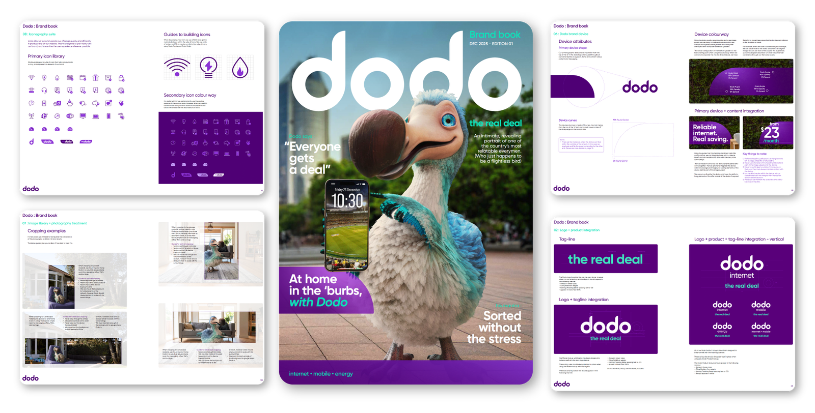
Dodo Brand Book Refresh
Turning brand personality into a scalable design system
As Design Lead at Vocus Group, I played a key role in the refresh of the Dodo Brand Book, helping evolve the brand from a set of visual rules into a clearer, more usable creative system for campaigns, digital, retail, social and internal production.
The goal was not to redesign Dodo from scratch. It was to sharpen what already made the brand distinctive, clarify how it should behave, and give designers, stakeholders and external partners a stronger framework to create with consistency, speed and confidence.
Role
Design Lead, brand stewardship, creative direction, systems thinking, team enablement
Scope
Brand guidelines, visual identity refinement, campaign usage, mascot behaviour, tone and creative consistency
Context
Dodo is a fast-moving consumer telco brand with a large volume of creative output across digital, print, social, retail, eDM, display and out-of-home. With multiple teams contributing to the brand across different channels and locations, the Brand Book needed to do more than document rules.
It needed to become a practical creative tool.
The refresh was an opportunity to bring more clarity to the brand’s visual language, define how the Dodo mascot should show up in modern campaigns, and create a shared standard for quality across the internal design team, offshore production team, agencies and stakeholders.
The challenge
Dodo has a distinctive personality: playful, direct, value-driven and recognisable. The challenge was to preserve that character while creating a more disciplined system around it.
The existing brand guidance needed to be easier to interpret, easier to scale and more useful in day-to-day production. Designers needed clear rules. Marketers needed confidence. Stakeholders needed consistency. And the brand needed enough flexibility to work across everything from high-speed retail campaigns to more expressive brand moments.
The refresh had to answer one key question:
How do we keep Dodo feeling playful and familiar, while making the brand easier to use at scale?


Process
The refresh was built around turning brand knowledge into a clearer working system.
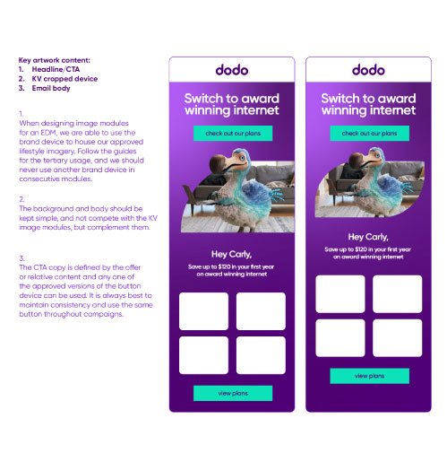
First, we looked at how the brand was actually being used across live work: campaign assets, digital layouts, social executions, retail messages, templates and mascot-led creative. This helped identify where the brand was strong, where it was inconsistent, and where the guidelines needed to become more useful.
From there, the work became about refinement and translation. Rather than creating abstract rules, we focused on practical guidance: how layouts should behave, how the mascot should support a message, how colour and hierarchy should create clarity, and how the brand’s playful tone could still feel commercially sharp.
The final Brand Book needed to support creativity, not restrict it. The aim was to give the team a stronger foundation so the brand could move faster without becoming diluted.
Outcome
The refreshed Dodo Brand Book gave the brand a clearer creative foundation and gave the design team a more confident system to work from.
It helped create stronger alignment between brand, marketing and production, reduced uncertainty around creative decisions, and provided a more scalable framework for campaign development across channels.
For me, the project represents the kind of design leadership I enjoy most: taking a familiar brand, understanding how it lives in the real world, then building the creative systems that help it show up with more clarity, consistency and confidence.
What I brought to the project